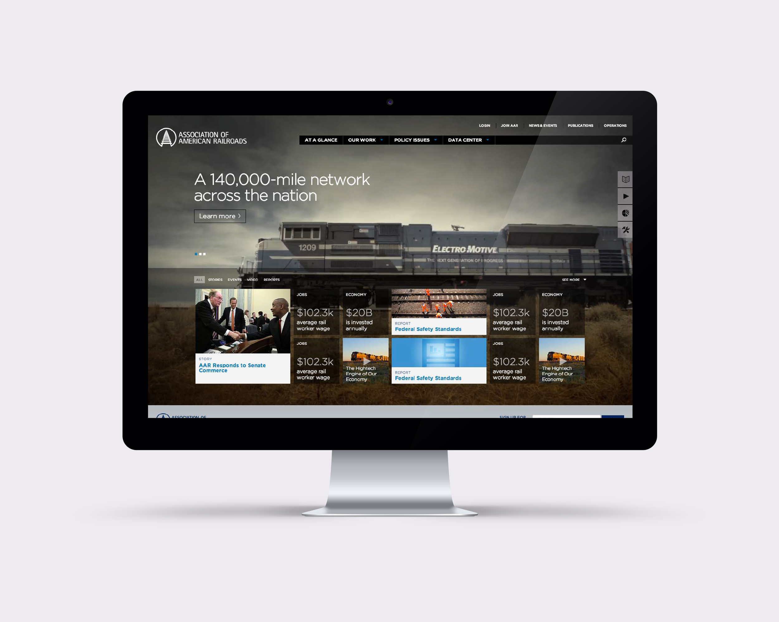
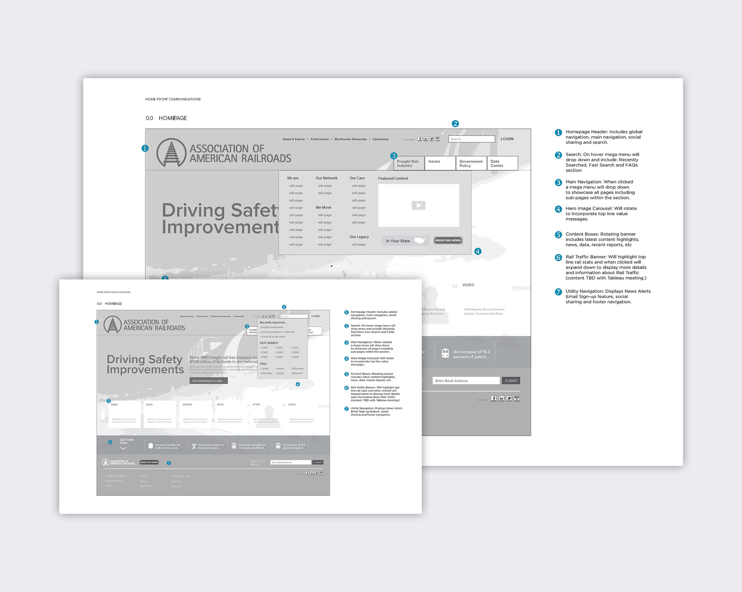
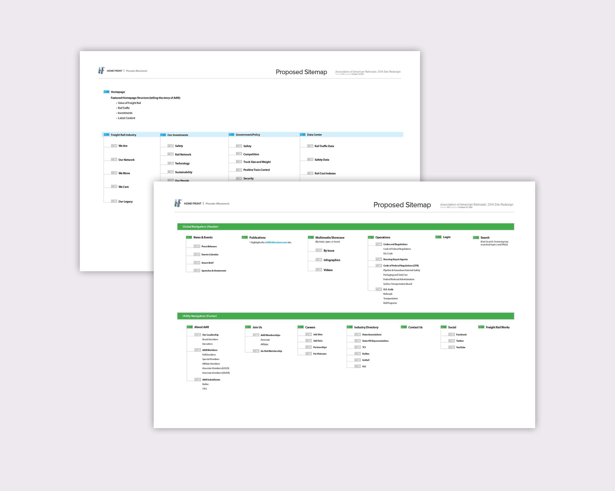
The Association of America Railroads had a website that was difficult to navigate, failed to highlight latest news, and looked outdated. It was also dense with content that was often times duplicated, or difficult to find.
With an association consisting of over 150 members, and at least 20 key stakeholders, getting a wide variety of users to the information they were looking for fast and efficiently was the primary goal.
AAR was also looking to convey a technology first approach to their association, so using video, and dynamic content, I refreshed their entire site, and gave them a platform to communicate with all of their stakeholders and association members that is still in use today.
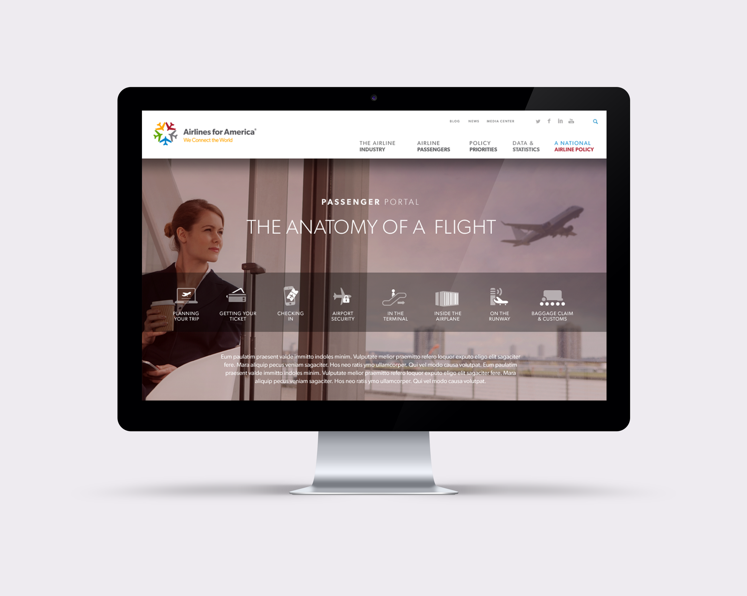
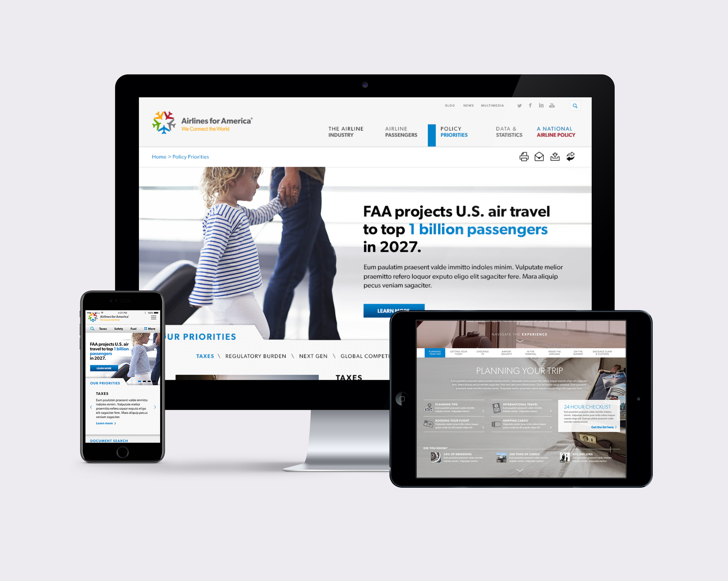
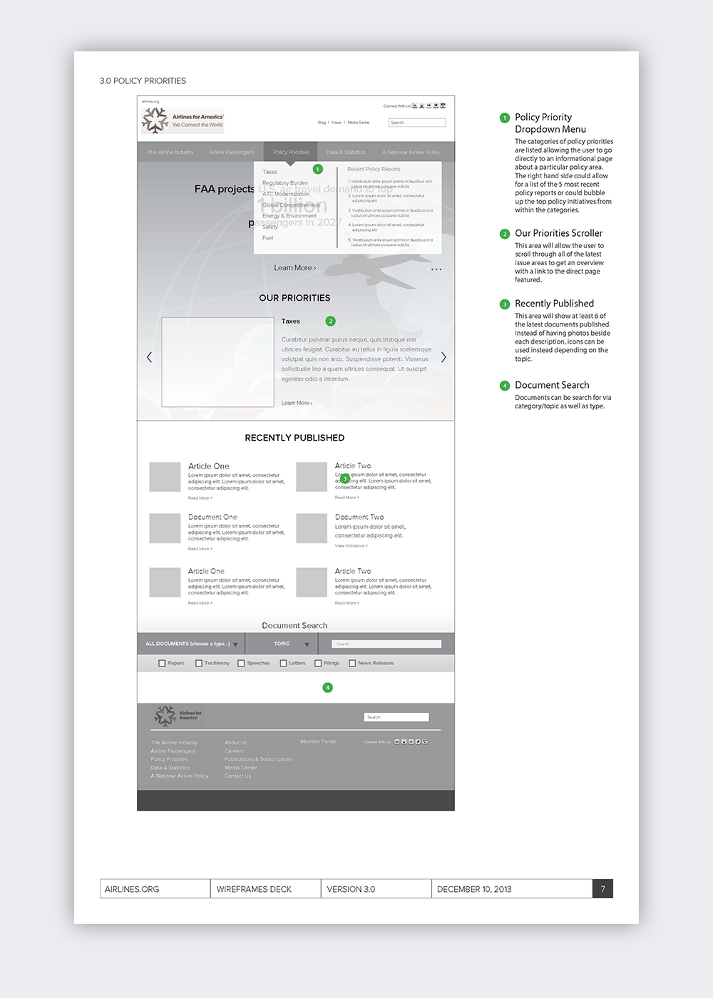
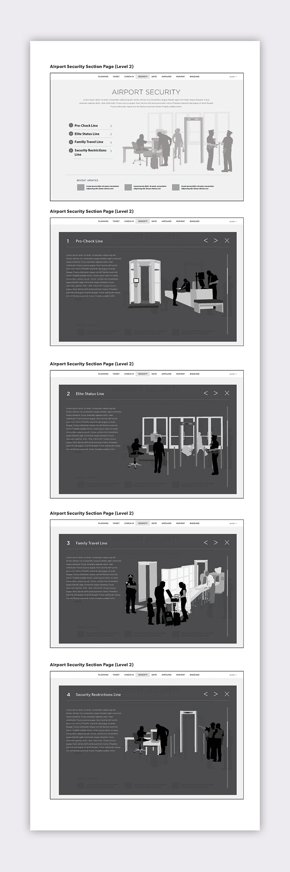
Airlines for America wanted a brand new look and feel to their primary website that would attract both consumer audiences, as well as association members and industry leaders.
The goal of the site was to take both data rich content, and consumer driven content and design a compelling, story driven site that would improve the fledgling image of the American airlines industry.
From concept to completion, I was able to provide A4A.org a completely new information architecture, along with a corresponding site map, wireframes, prototypes and annotations. In the end, the client had a fresh site for both industry and consumer types that is still in use today.
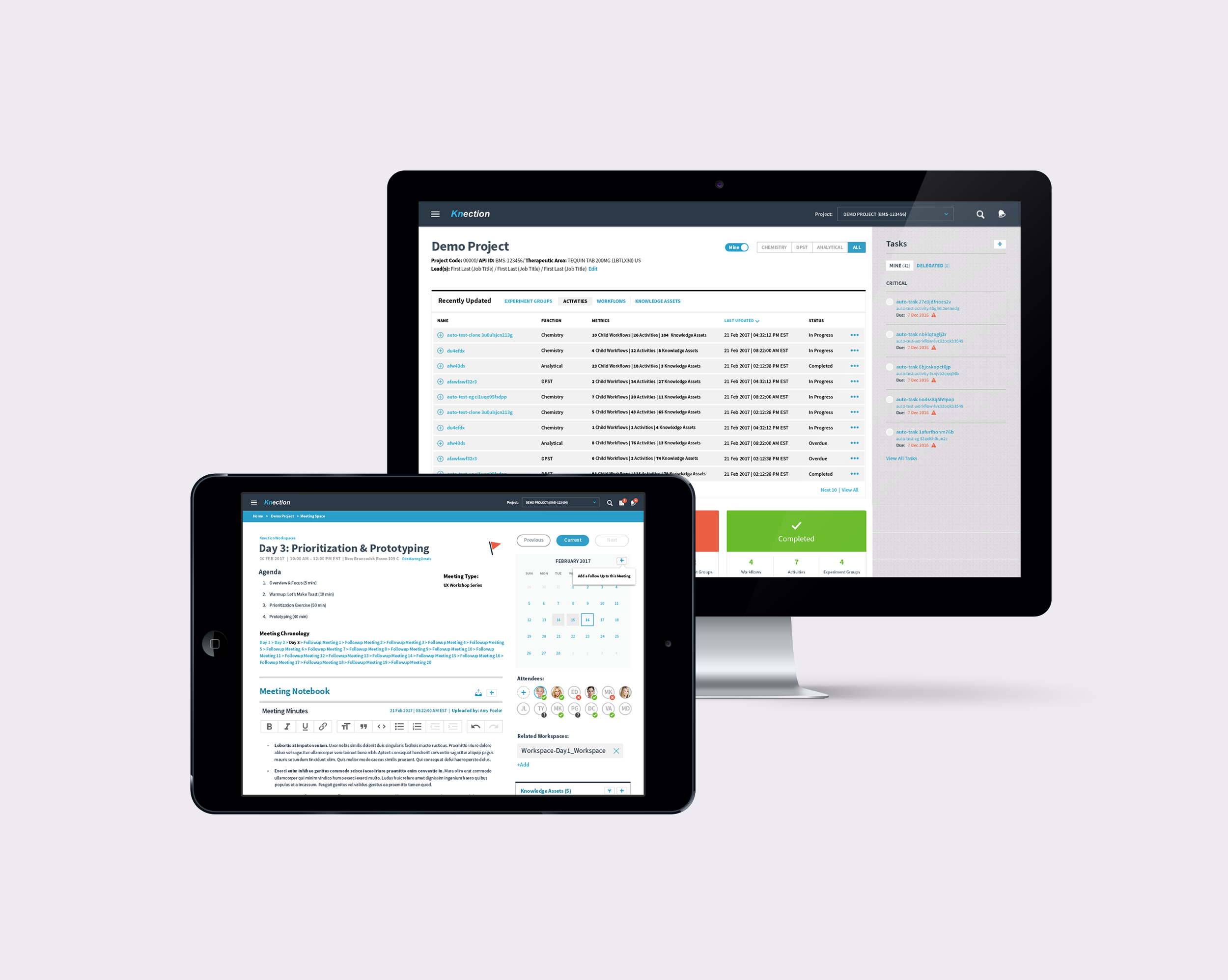
Bristol-Myers Squibb, one of the world's leading pharmaceutical companies, wanted to create an application for their scientists that would enable them to track, record, deliver, and manage the development of pharmaceuticals.
I lead several key stakeholders in UX workshops driven to identify key user needs, and define an ideal working process. From there, everyone from project managers, scientists, data analysts, technology leads, and operations teams met with me twice a week at the BMS campus in Bristol, New Jersey where I conducted rapid prototyping exercises, and presented iterative wireframes through interactive demos every week.
The result was an improved application experience that allowed a variety of user roles to manage tasks, track data, store meeting notes and assets, and view the history of any given pharmaceutical's development.
I worked on this application with a project manager and technology lead, to deliver an application that BMS is still using and enjoying today.
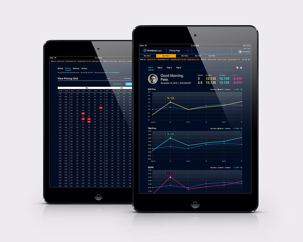
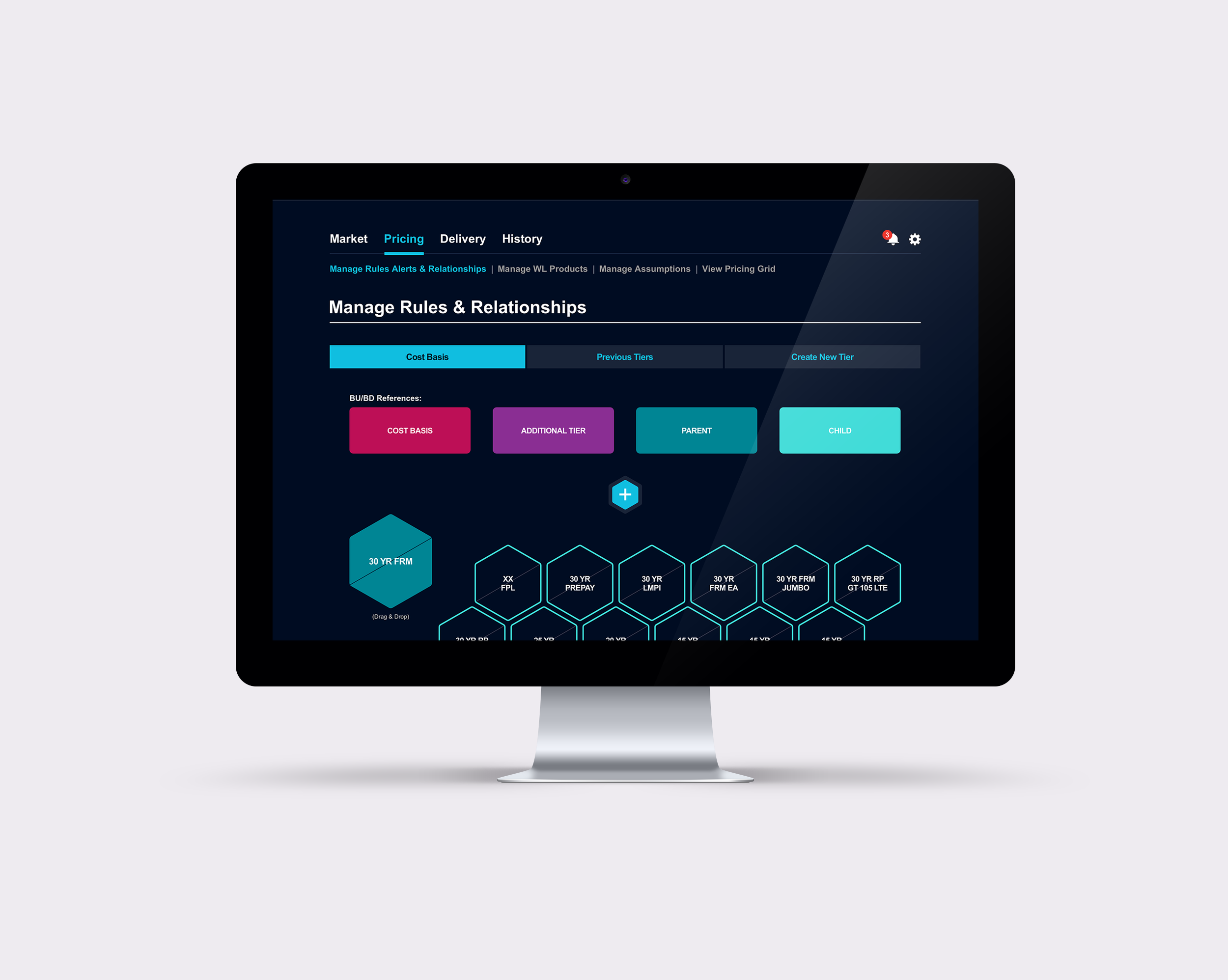
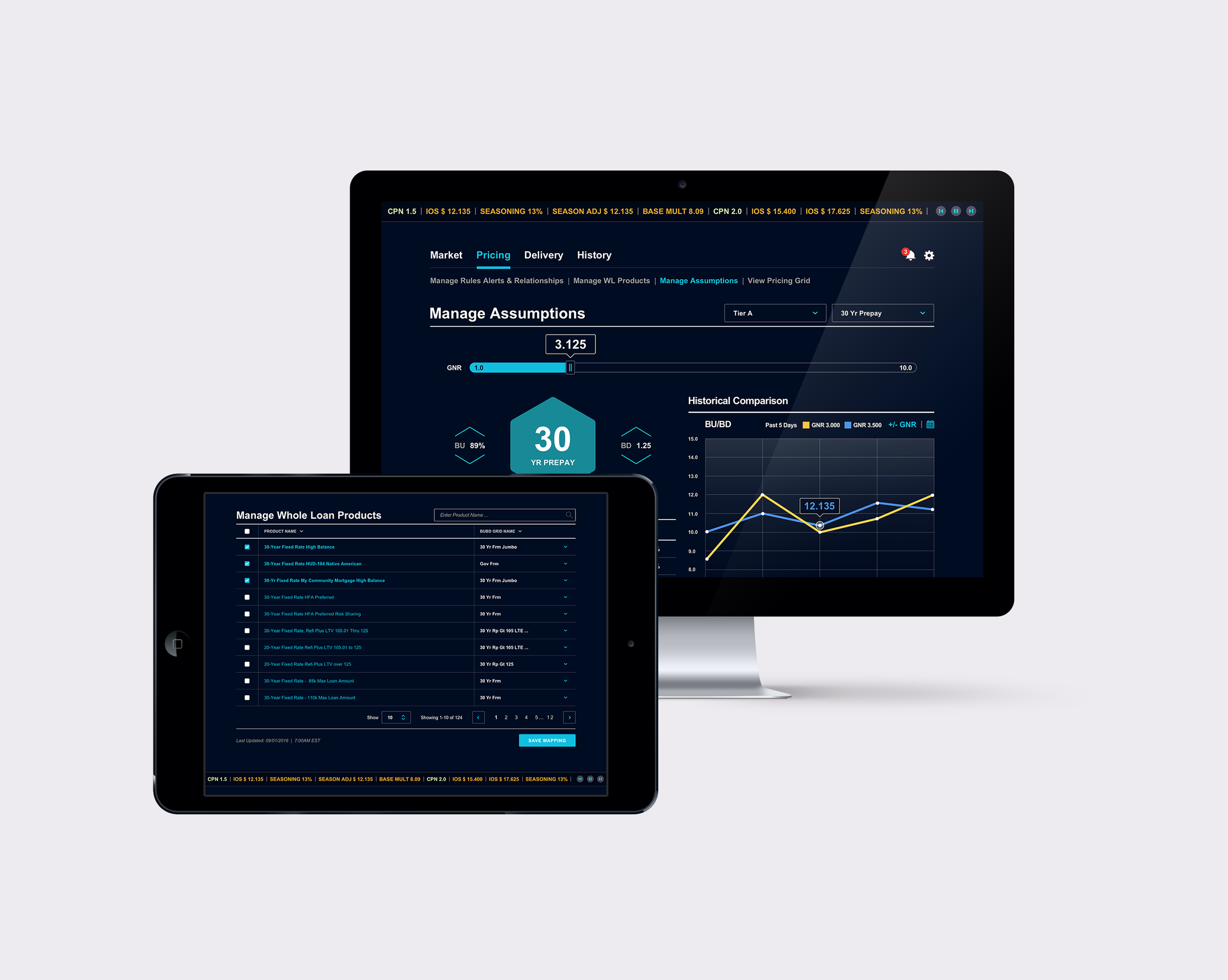
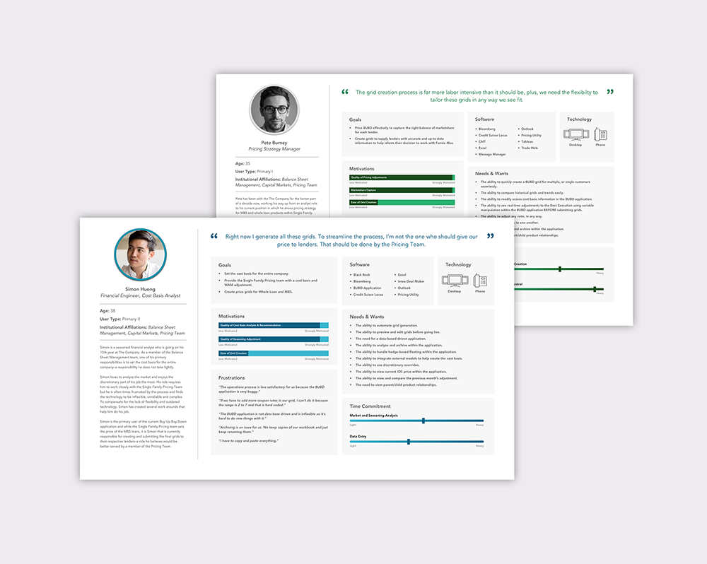
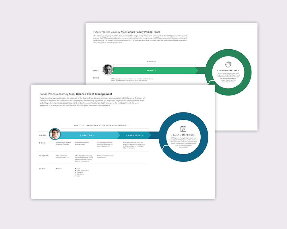
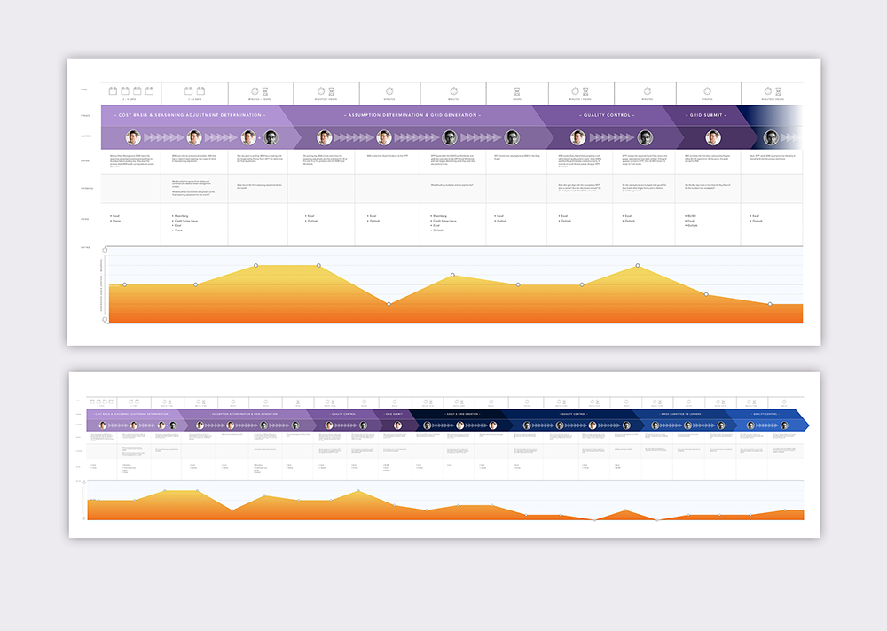
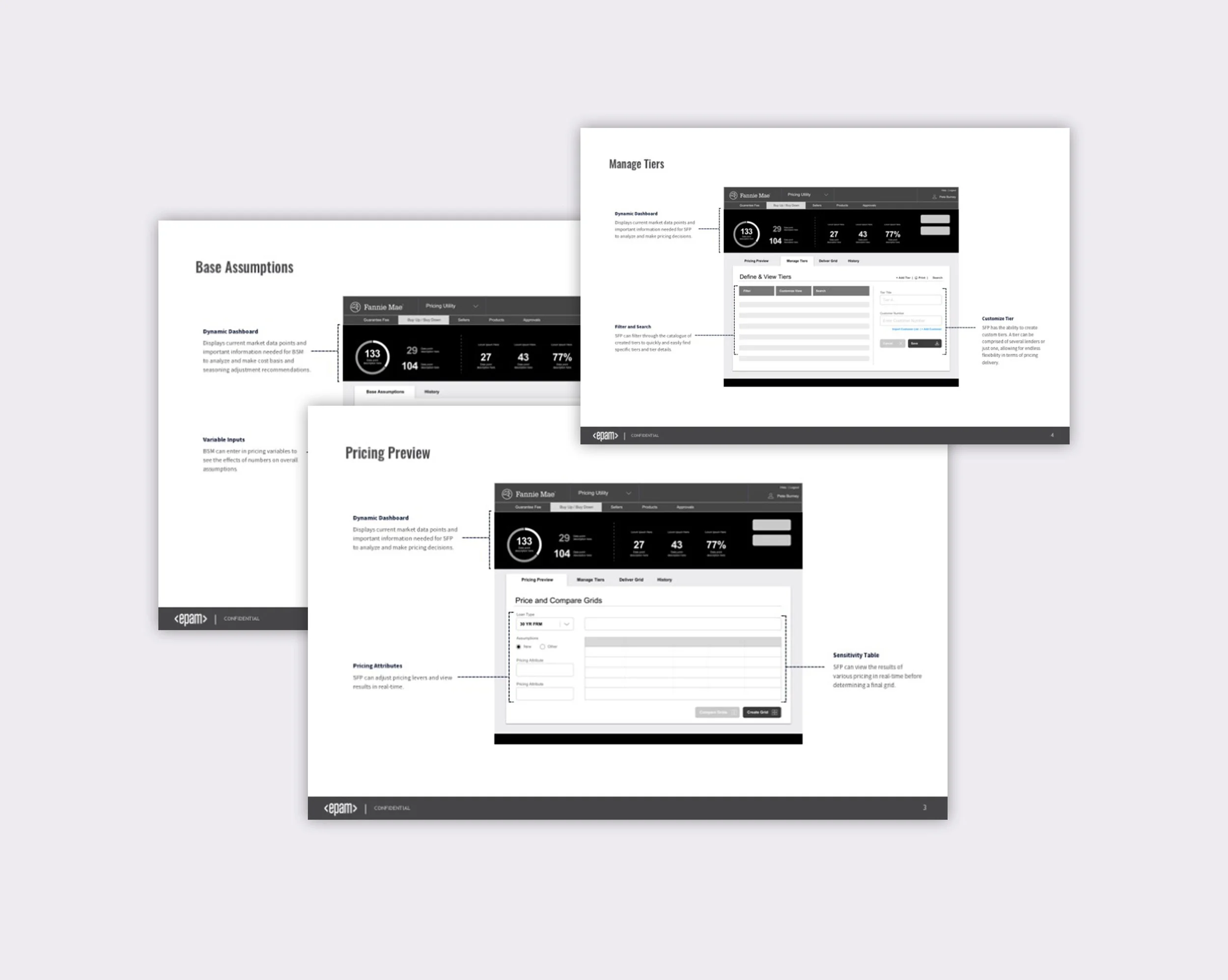
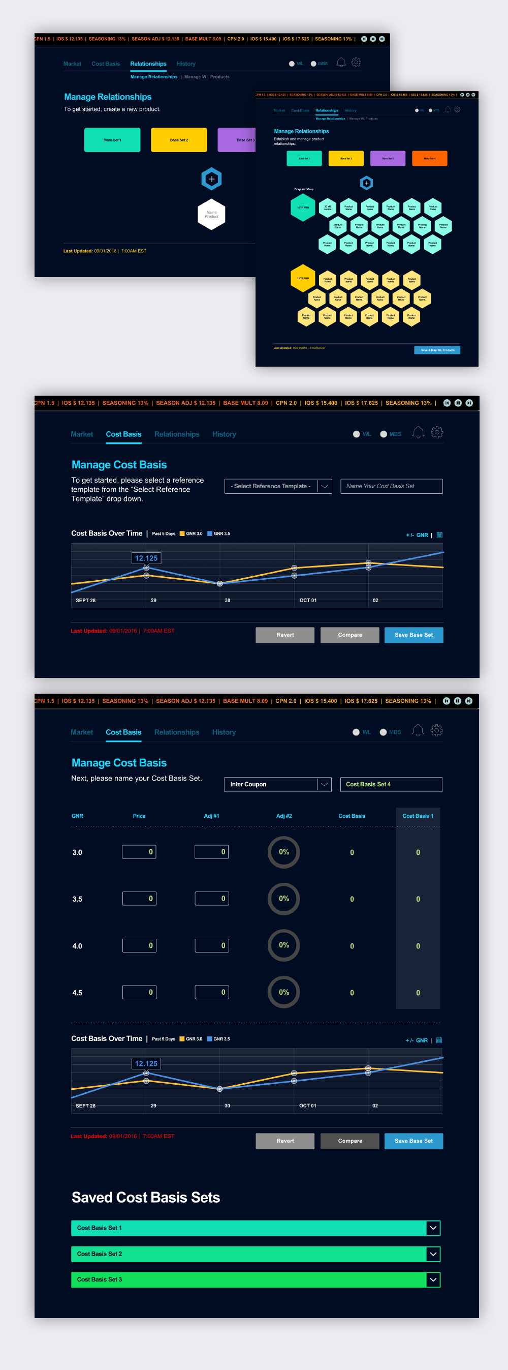
One of the world's largest Mortgage Backed Securities firm in the world, needed an application that would enable their Capital Markets team to price MBS loans. Their process hinged on outdated technologies that was riddled with bugs. The Capital Markets team was relying on manual processes as workarounds to the bugs and inefficiencies of their current application. This resulted in constraining their ability to deliver pricing grids as fast as their competitors.
Aside from a new application, I wanted to understand what their current process was. I wanted to know who was involved, what were the handoffs, what were they using to ultimately create and deliver pricing grids, and from there, determine an approach.
I started by leading the Capital Markets team in a variety of workshops and user interviews. I sat with many of them as they walked me through their daily process, and I observed their work patterns. By the end of discovery I had not just developed a journey map, I was able to point to exact numbers of handoffs, direct places of inefficiencies, and create a more transparent environment that lead to not just an application design, but overall organizational transformation.
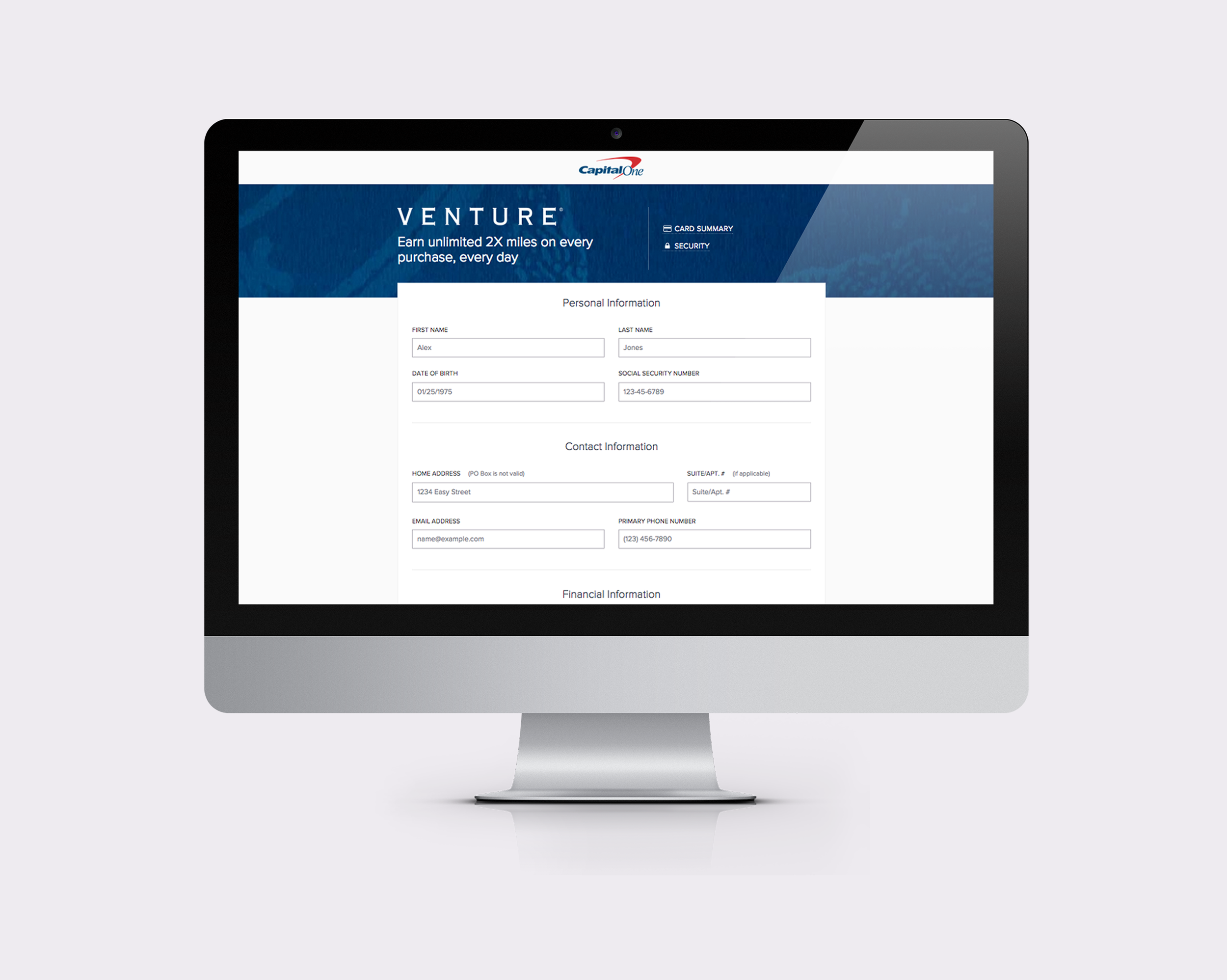
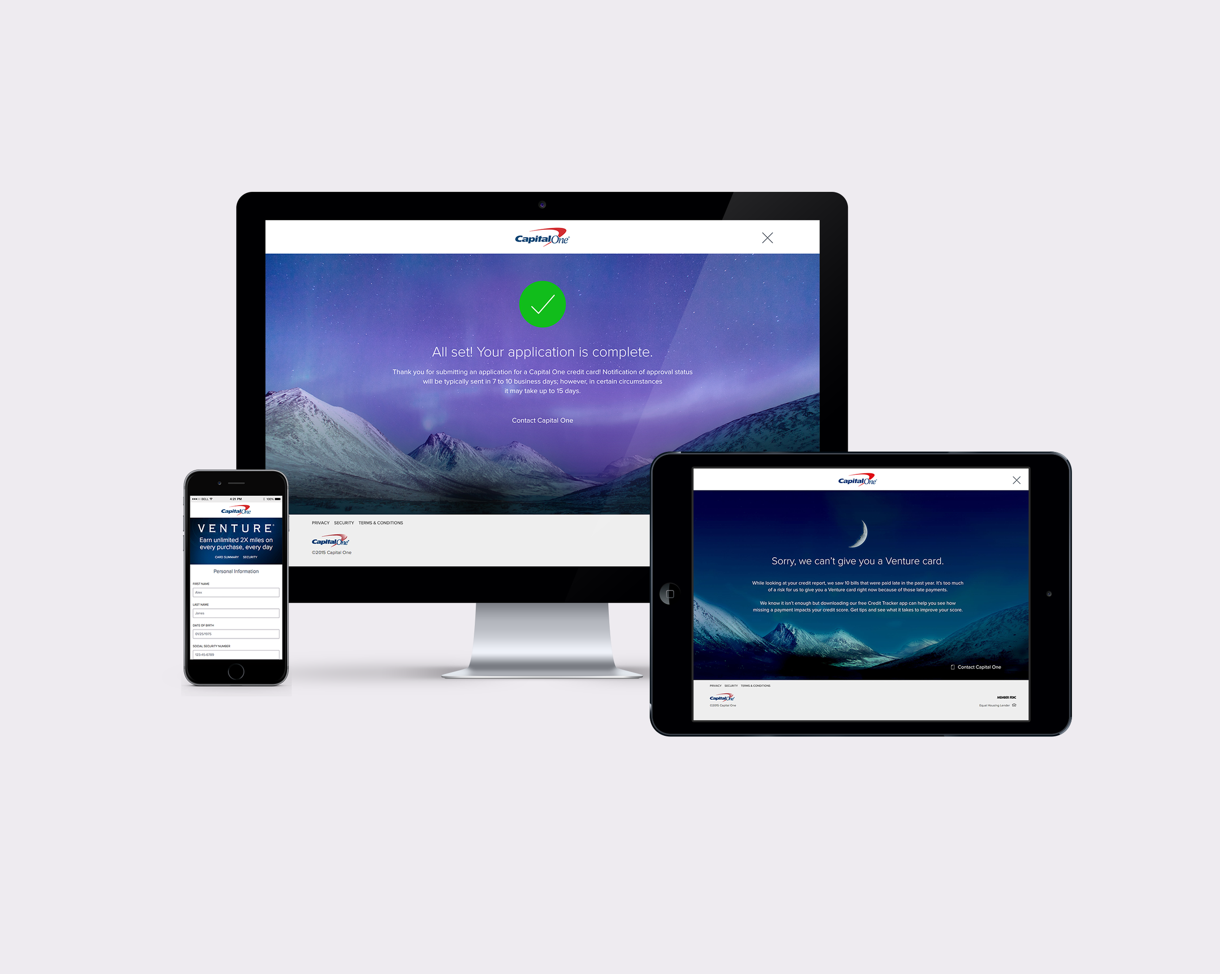
Capital One wanted to reimagine the online credit card application. They wanted to simplify the experience and provide customers with reasonable expectations, and conversational explanations as to the final outcome of their application.
This was a complex project because each credit card application lived on a separate platform, so one of the main considerations was how could I design this application to accommodate all credit card products seamlessly? Other considerations were that it had to be ADA compliant, and it had to speak to customers who could be declined, without negatively impacting their relationship with Capital One.
After months of user interviews, user testing, prototyping, and working with an agile team of 8, we were able to deliver an application that felt human, helpful, and kind.
The application went from 37 input fields to 12 and included placeholder hint text, real-time error messaging and input validation, responsiveness and user centered language and design.
The results during early testing, where we launched to just 1% of all Venture Card traffic (roughly 20 applications per day), showed a 6% increase in app completion rates, and a 70% reduction in flow downs.
By the time the application launched to 100% of traffic, which is equivalent to about 16 million applications per year, conversion was up by 6%, resulting in an increase of revenue totaling around $1,000,000.
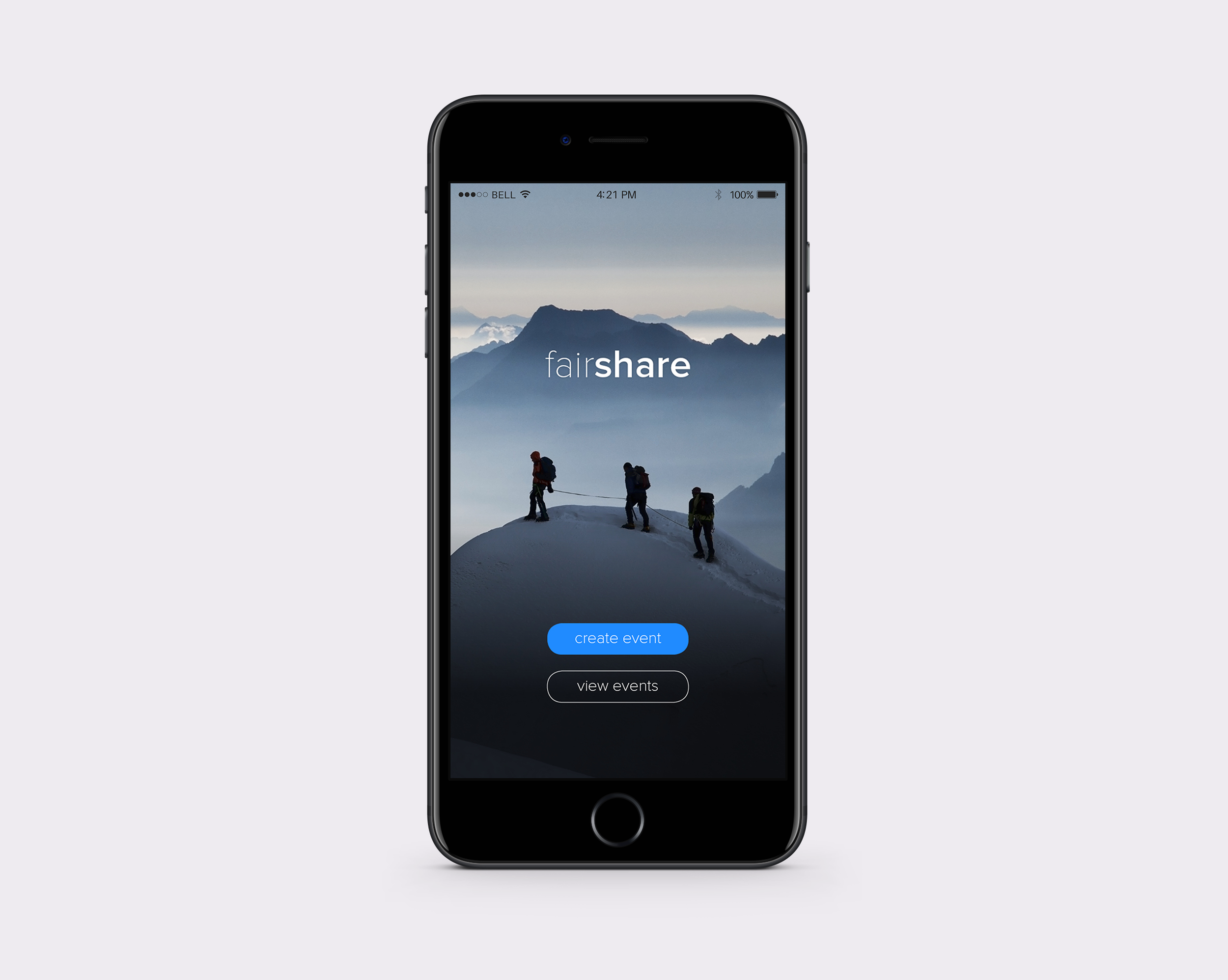
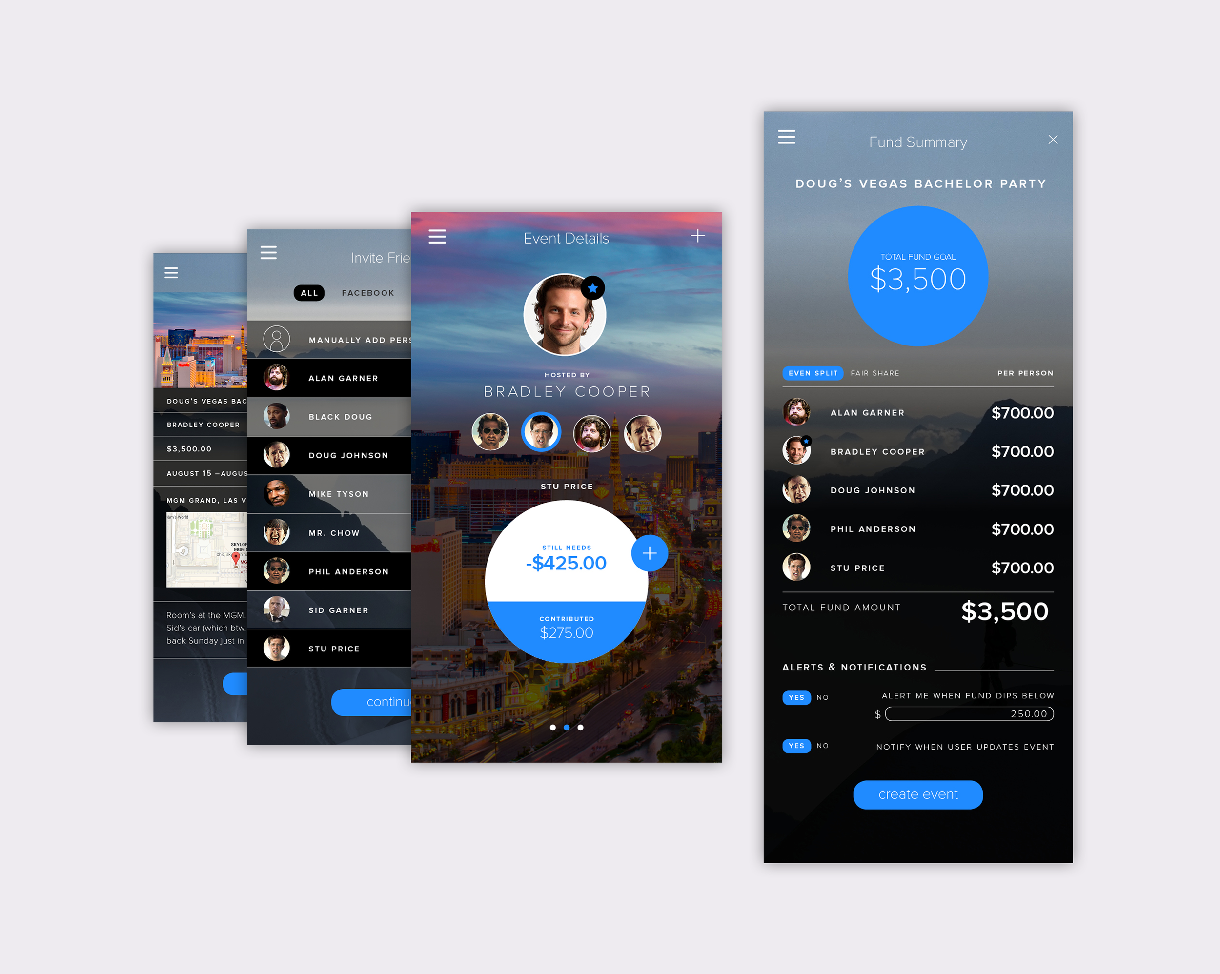
FairShare was an application concept developed to answer the question, "How do you take the awkwardness out of asking a friend for your money back?"
After several rounds of user interviews, wireframes, and prototypes, the FairShare app was designed. I didn't want to design another Venmo, or Cash app. I wanted to solve a unique financial problem, and so I, along with a product owner, chose the use case of saving for group trips.
I co-lead several interactive user workshops where we simulated group spending scenarios, and observed and interviewed users to gain insights that would inevitably help me design a full blown prototype to pitch to lines of business for development.
What came out of it was an application that allowed users to track and save for large upcoming events. The app prevented the need for a single user to have the cash/credit up front to pay for large group expenses.
Testing went so well that a line of business did pick up the application and was willing to fund the project.
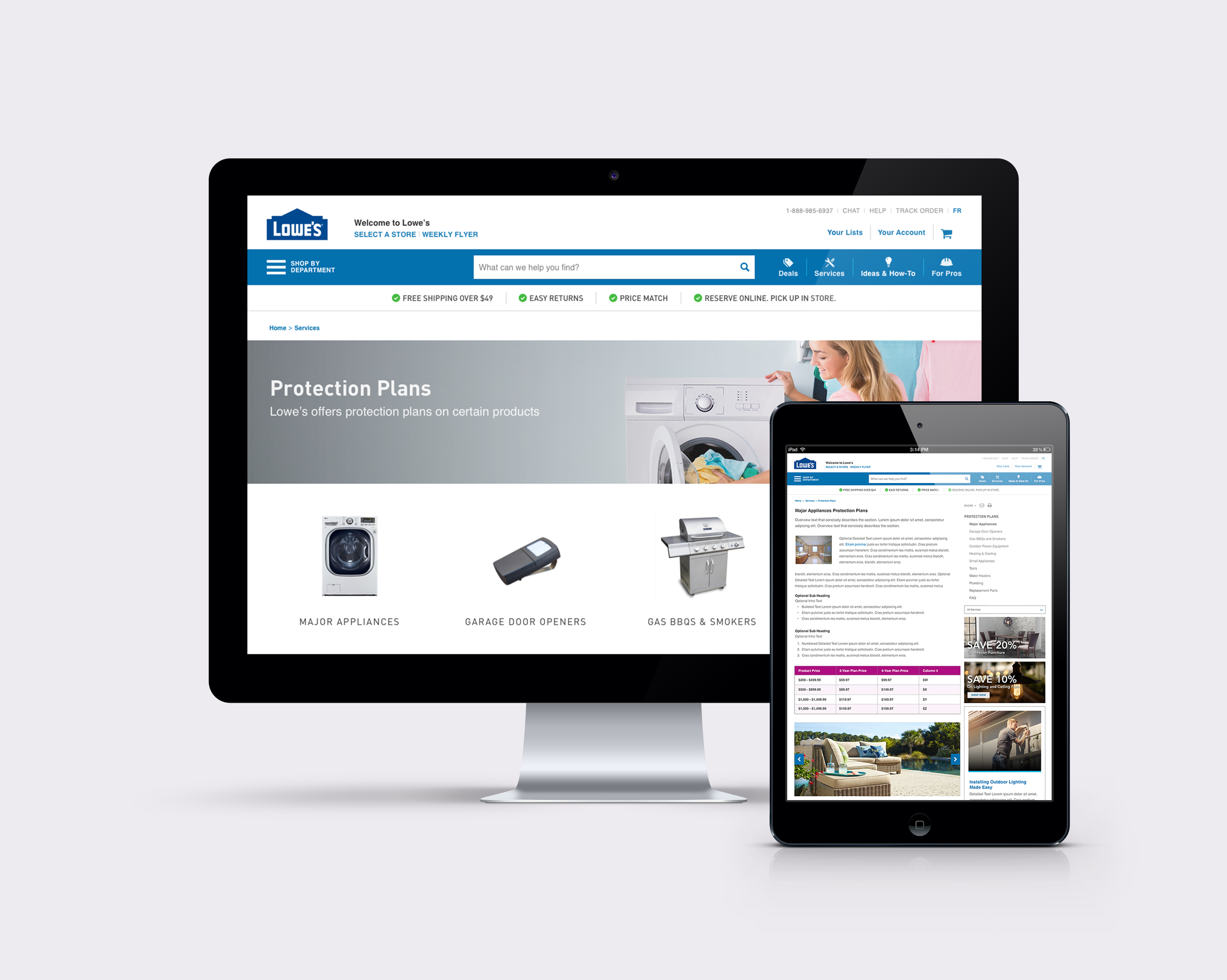
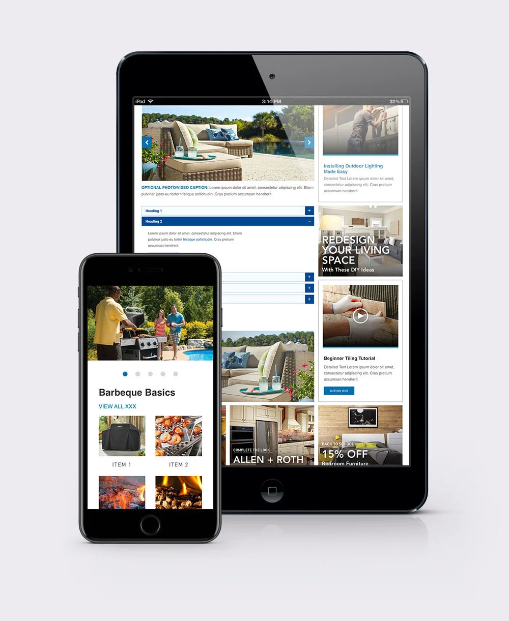
Lowes Canada was a quick turn around project I was on for a week. The team needed help creating generic landing and detail pages for their Lowes Canada site, which was being built on Sitecore. They needed a template that was extremely flexible, and that could house several components.
I came up with both desktop and mobile versions of the generic landing, and generic details pages which are currently in production today.
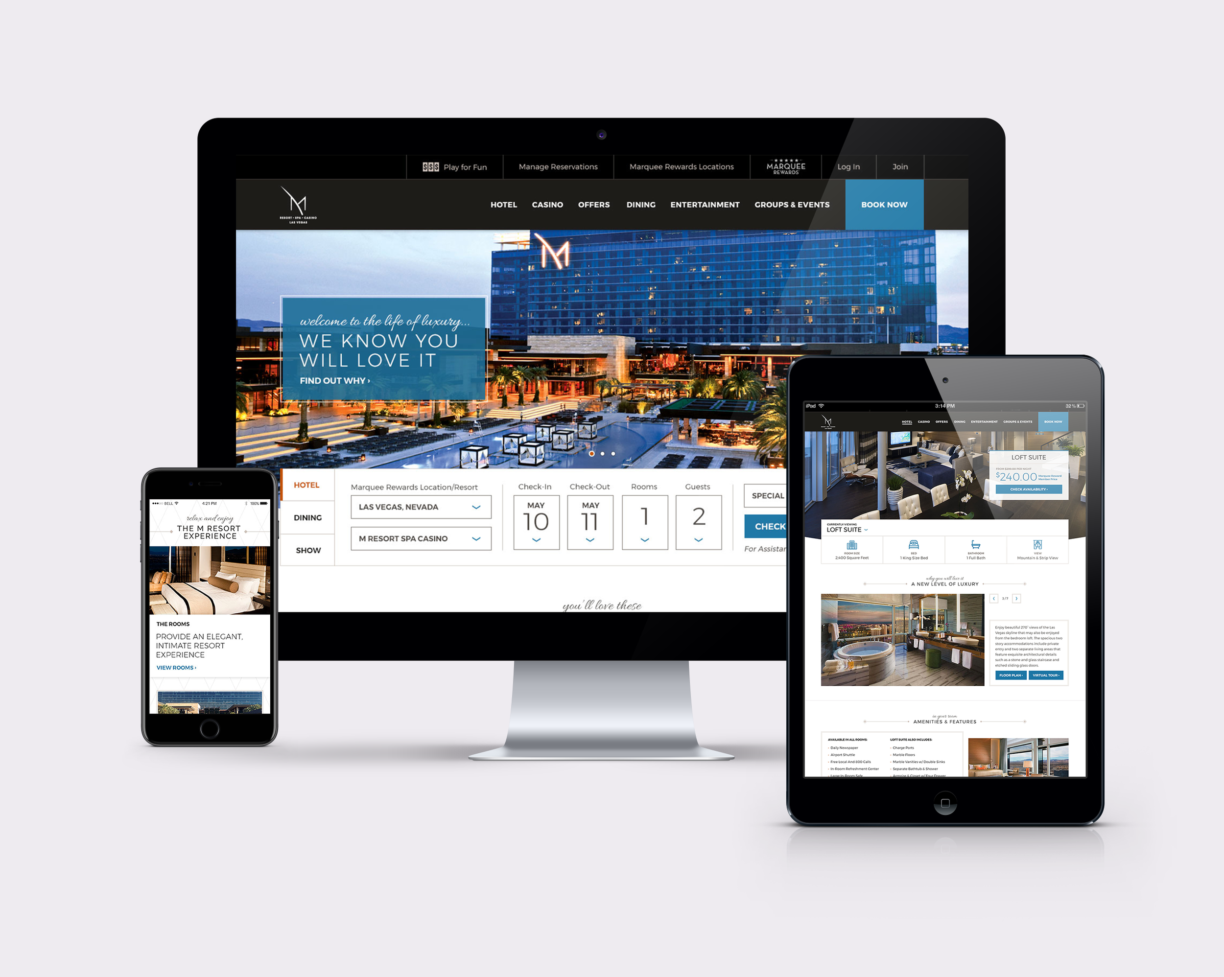
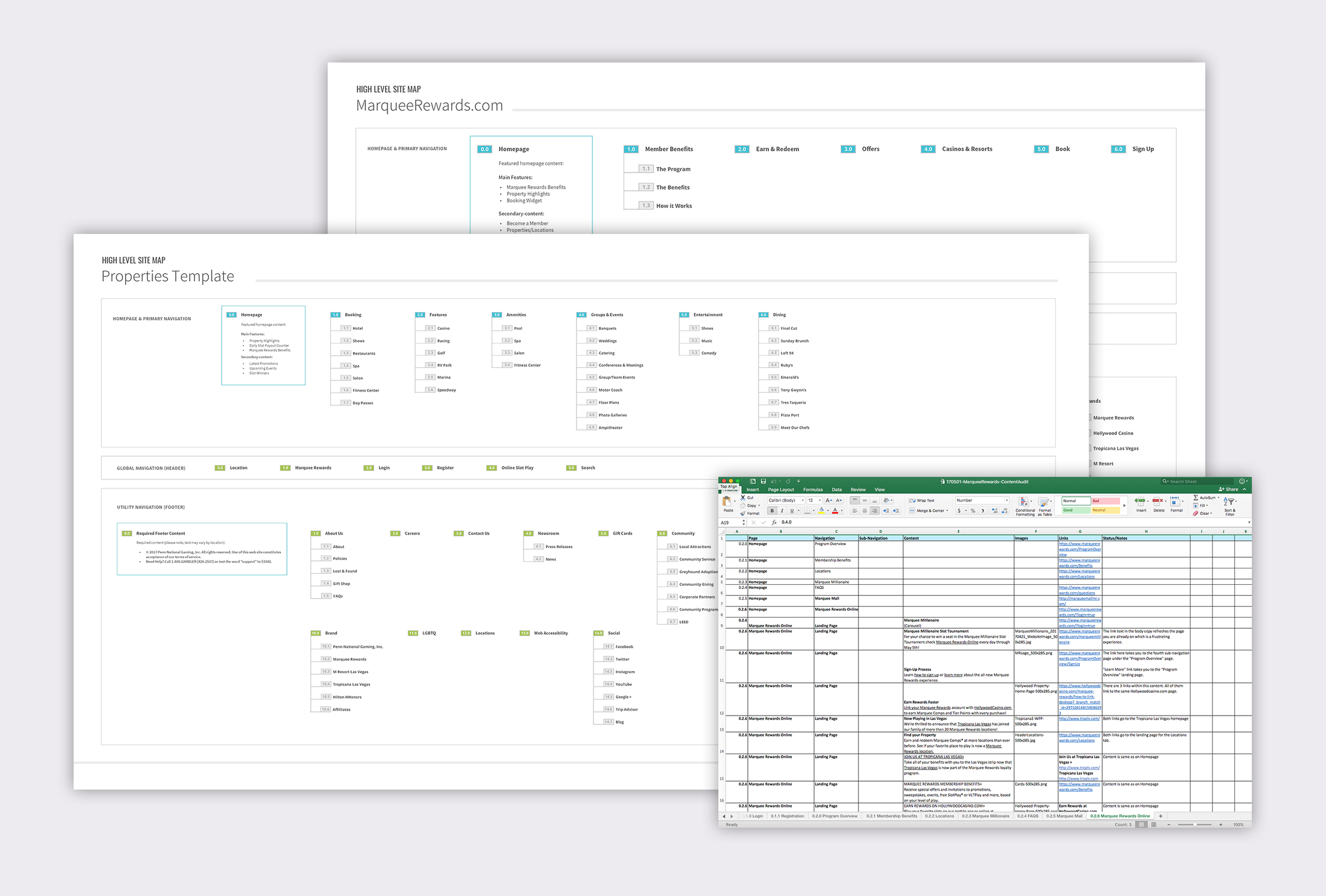
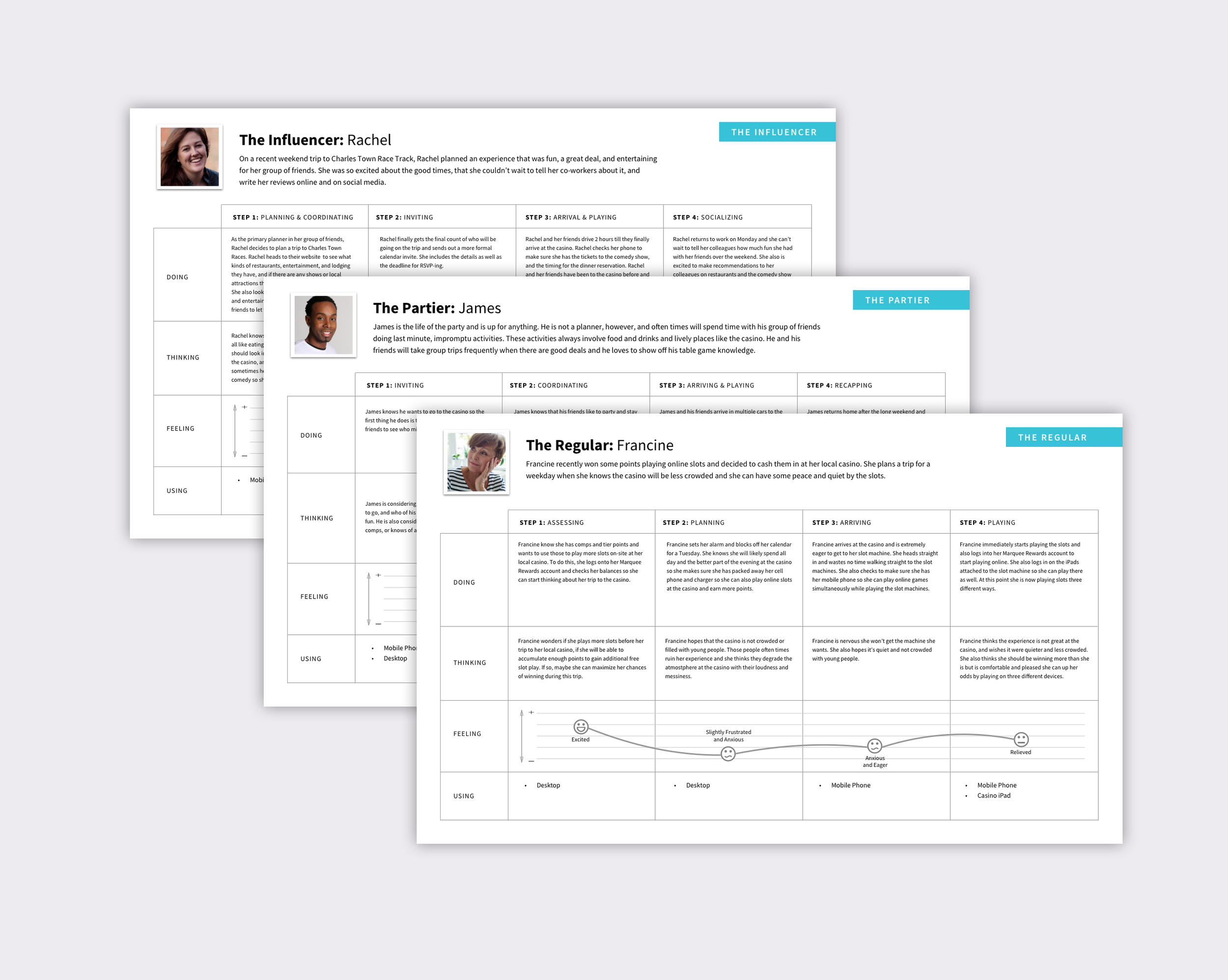
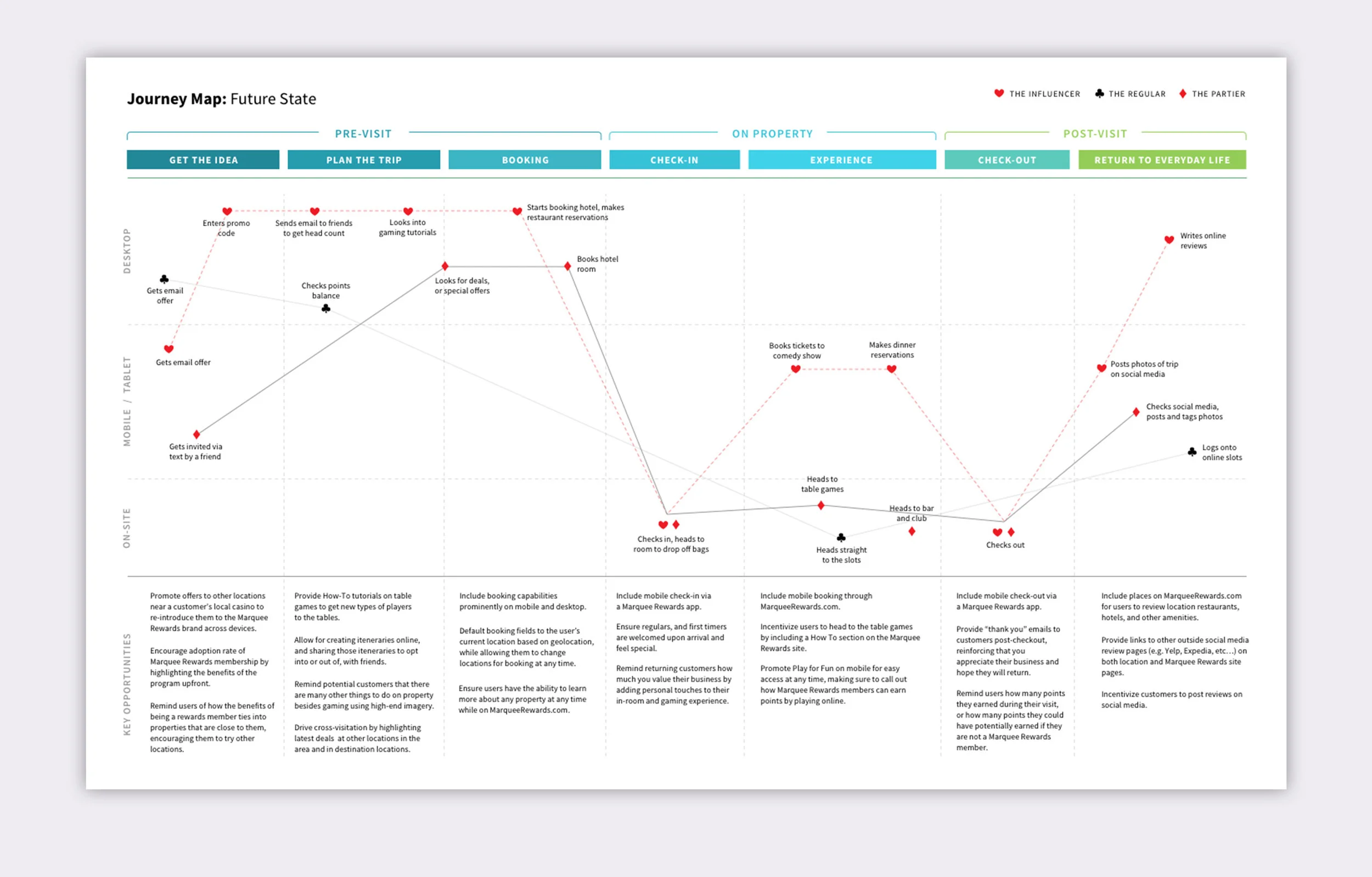
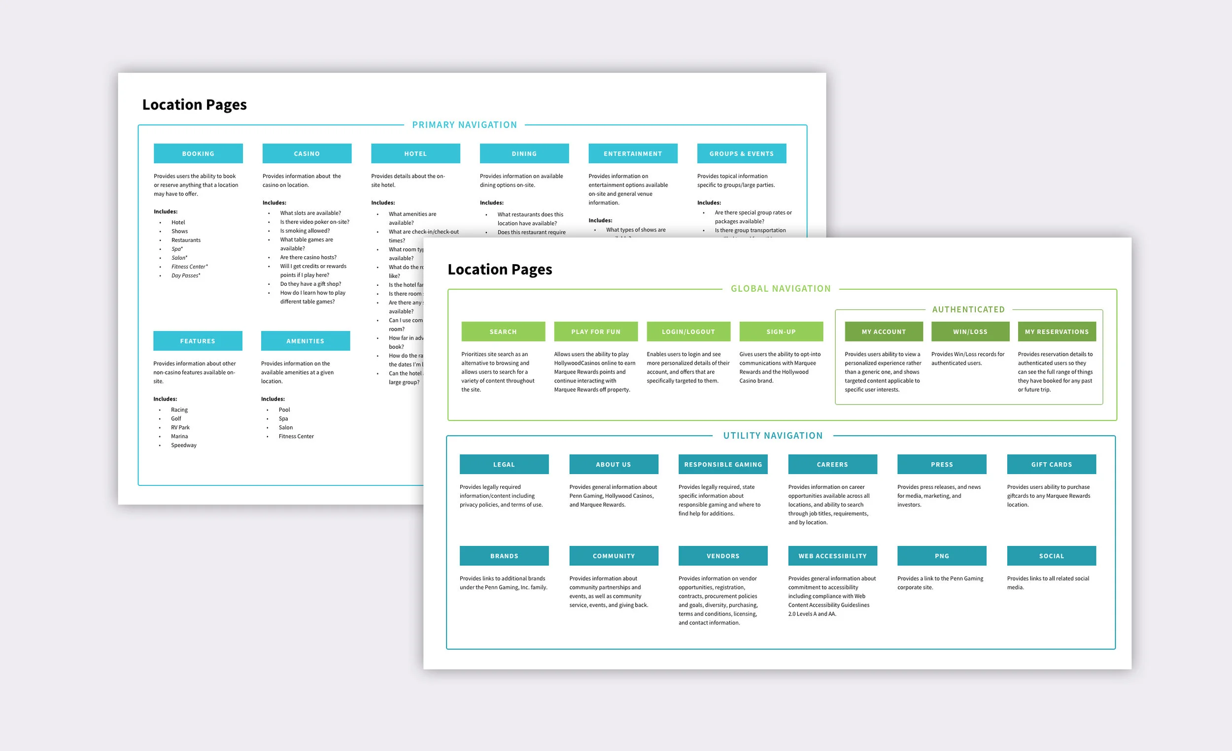
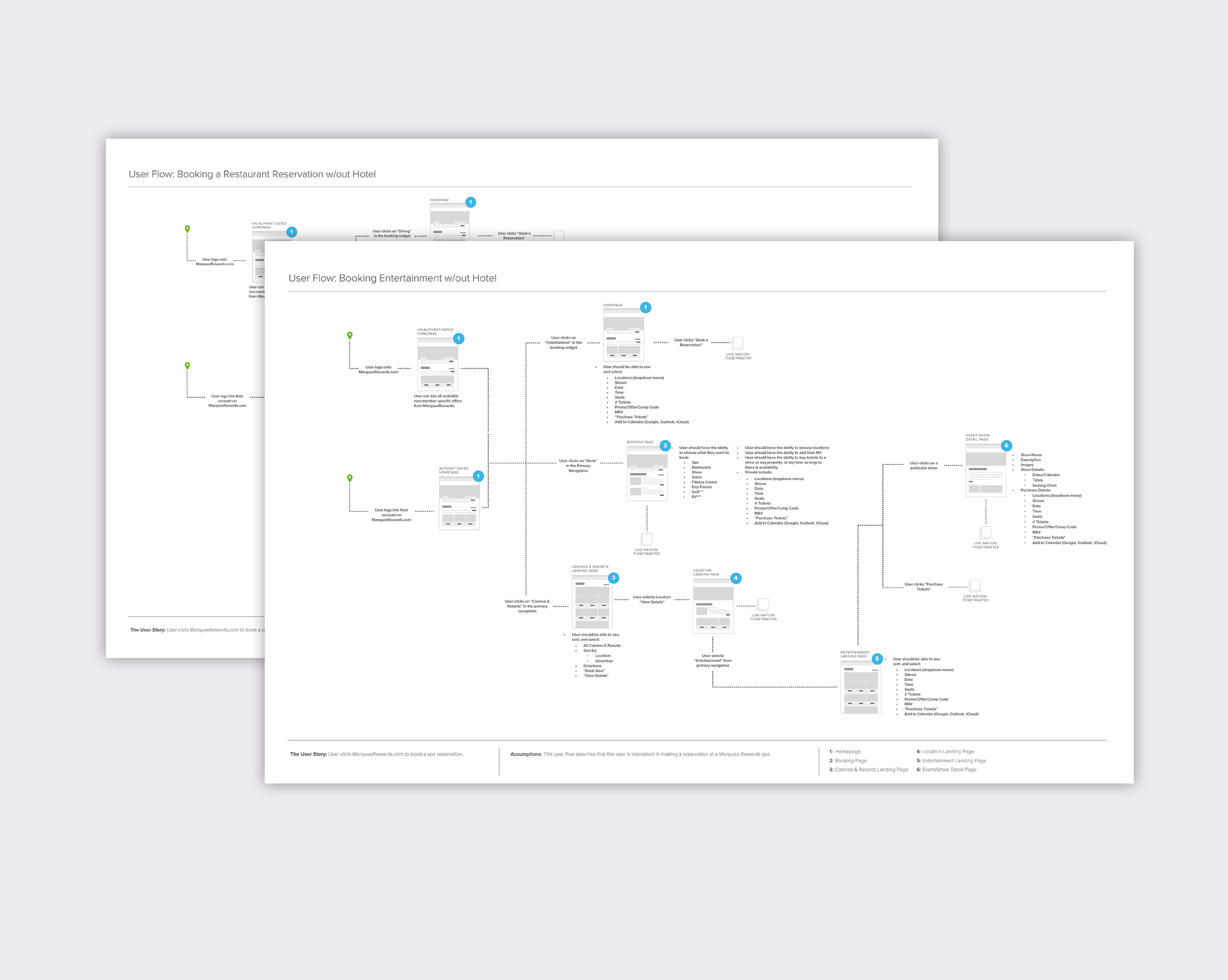
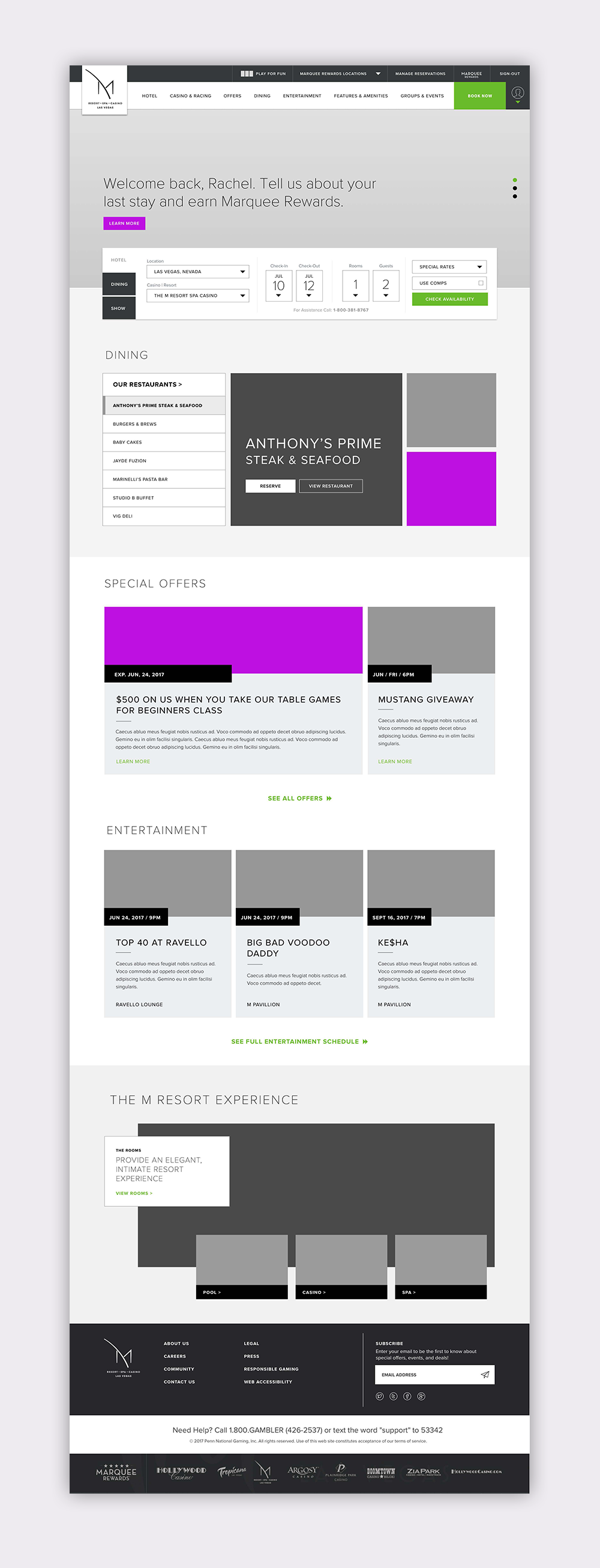
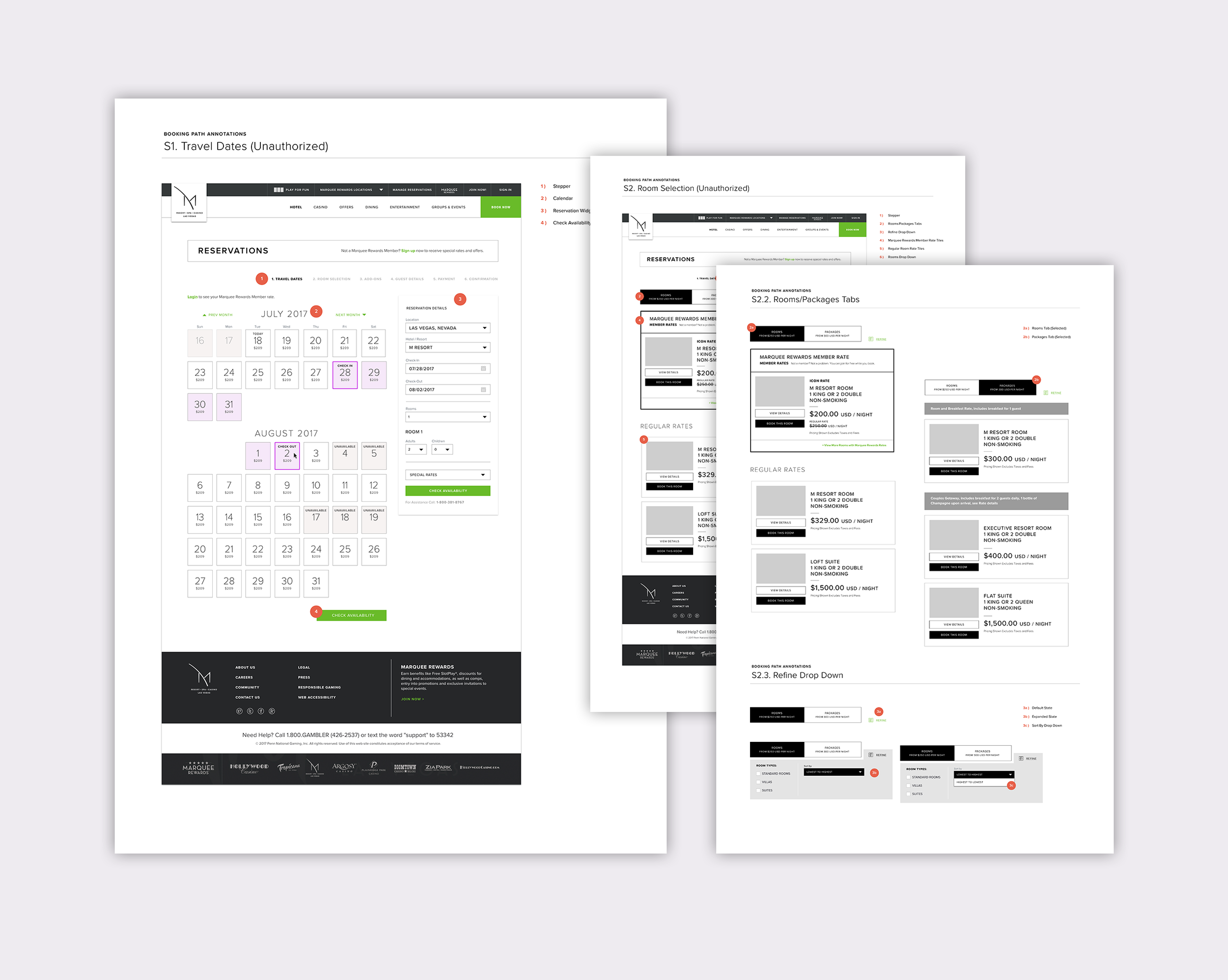
Penn National Gaming is a casino and resort company that wanted a fresh new website, built on Sitecore with the ability to create a from scratch booking and personalization experience.
I worked with three visual designers, a project manager, a technical lead, and a client engagement manager to design a strategy and experience that would elevate their brand presence and rewards loyalty program within the gaming industry.
The scope of work included a content audit, site maps, personas, journey maps, conceptual organization, personalization strategy, wireframes, annotations, and visual design.
The final outcome was a site that could house all of their property sites, as well as become a gateway to their rewards loyalty program.
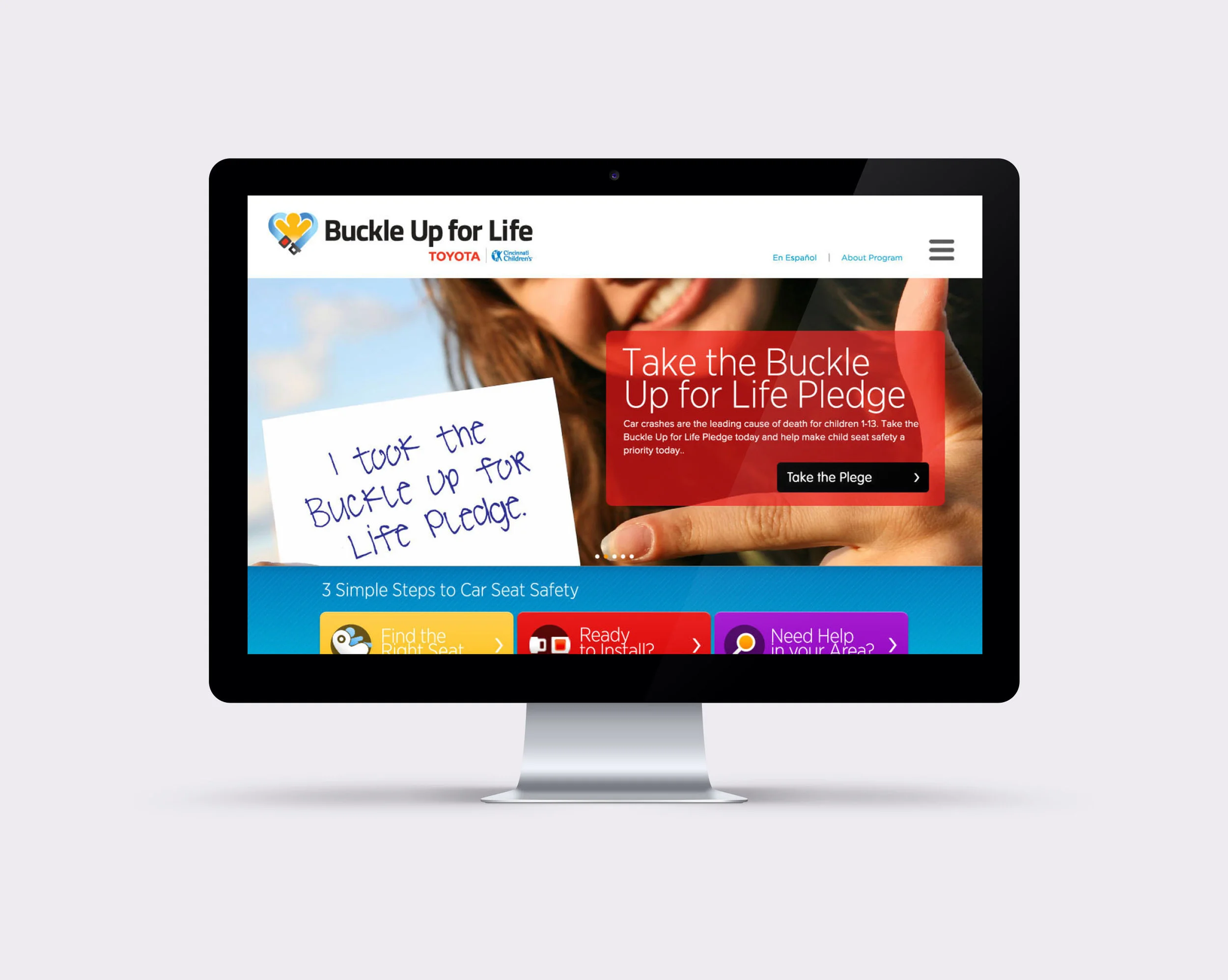
One in three children involved in a car accident die every year, and so Toyota and Cincinnati Children's Hospital teamed up to form a partnership called Buckle Up for Life. The mission of the partnership is to educate and create awareness around the importance of proper car seat installation.
My role was to create a site that was engaging, friendly, and positive. They wanted a site that would inspire users to learn the proper way to install a car seat, and proactively seek out inspection stations to ensure proper installation was achieved.
Using video tutorials, illustrations, and an API that allows users to locate safety inspection stations, this site has been, and continues to be a success. To this day, it's one of the projects I'm most proud of, and it is still in operation today.